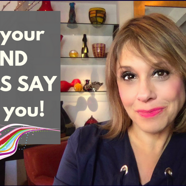
How do the colors you use in your business visually connect to you and your brand?
Join me in this Quick Tips video as I explain the importance of having the right brand colors that are aligned to your business.
I’m not going to get all spooky on you but there is a subliminal, hidden meaning of what your brand colors say about you.
The colors that you use to represent yourself in your business and online are part of the instant visual message that that you send. Before you have time to say a word, people assume different things about you from the first impression that your brand silently speaks, and sometimes that can even be damaging to how you are perceived.
Your brand colors need to be aligned with what you are attracted to along with colors that best represent your industry. For instance as a lifestyle coach, you wouldn’t want brand colors that are the typical corporate blues and greens. As an investment strategist, you wouldn’t want to select girly pastels.
Recently, I was looking at a colleague’s website and was pretty shocked by the visual message that the colors on her site were sending. She’s a super smart, savvy business coach who specializes in finance and money.
BUT….
Her main site color is copper…. the color of a penny!
Now, let’s think about the visual message that a money coach is sending when her site is the color of the lowest denomination of U.S. currency.
Luckily, something like this can be easily correctable by simply popping up the color a few shades to be closer to the more vibrant and powerful burnt orange that she was after.
When you are designing your logo or website, it’s best to get your brand colors right from out of the fate as they will stay with you for years to come and become a familiar beacon of recognition for your audience.
For instance, through all the rebrands and design of FocusOnStyle since it was first online in 1999, the colors remain fairly consistent to compliment our “eye” logo and represent the modern, confident, and successful woman brand.
Certainly, if your colors become too trendy or dated, or whenever it feels right for you, it is perfectly fine, if not recommended to update your colors to stay relevant.
Not sure how to find brand colors that you are attracted to? Listen through the video to hear a nifty trick for identifying your best brand colors that most appeal to you.
So, tell me how to dour brand colors live up to you?
If you are looking for more ways to step into your star power, claim your free STAR Power Kit and stay in my loop.
Please take a peek at the hot-off-the-presses NEW pages that I created with you in mind:
- About–https://focusonstyle.com/about-sharon-haver/
- Home– https://focusonstyle.com/
- Work With Me– https://focusonstyle.com/work-with-me/
- In the Media– https://focusonstyle.com/pressclips/
- Freebie– https://focusonstyle.com/insiders
- SPOILER ALERT: Wait List for Simply Amazing Headshots program- http://www.simplyamazingheadshots.com
FocusOnStyle Quick Tip Videos with Sharon Haver are on the go (unedited, undone, real life) one take, one minute videos designed to help you elevate your business, life and style each day. For the QuickTips Video Library, click here.
Related Posts
- The Hidden Meaning Of What Your Brand Colors Say About You [Quick Tips Video]
- Reinvention Advice To Have A Relevant Personal Brand So Your Small Business Doesn’t Fall Behind! [Quick Tips Video]
- Reinvention Tips: What Happens When The Something You Do Is Not The Something You’re Known For? [Quick Tips Video]
- Personal Branding 101- How Your Personal Brand Is More Than You Think It Is [Quick Tips Video]
- The BIG Rebrand! New Look, New Resources
- Personal Branding 101: What About Those Phonies?
- Women Entrepreneurs: Your Business Coach May Be Keeping Your Broke! [Quick Tips Video]
- [7 Days To Amazing Podcast] How To Express And Develop Your True Brand With Jena Rodriguez
- [7 Days To Amazing Podcast] How To Be Authentic In Your Brand, Business And Life With Hilary Eldridge
Video Library
Binge watch on the FocusOnStyle Video Library.
Subscribe in YouTube
Don’t miss any of my Quick Tip Video. Subscribe in YouTube, here:

